CerebralArt
Branding project done for and under CerebralArt advertising agency. Below you can see a small case study containing the old and the new logo, a few of the final versions, the stationery design (letterhead, envelopes, business cards design) and the brand guidelines / the logo guidelines manual. Logo redesign, stationery, brand guidelines. Designed in 2008-2009.
Logo evolution: a. old logo used until 2008, b. a temporary 2008 update, c. the new logo designed by us, in use starting 2009
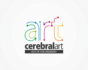
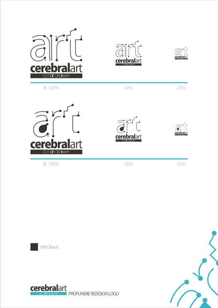
Variations: a few of the shape and colors variations / evolution that leaded to the final design
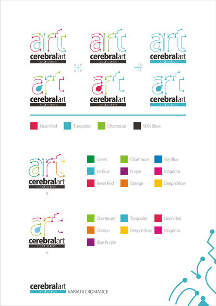
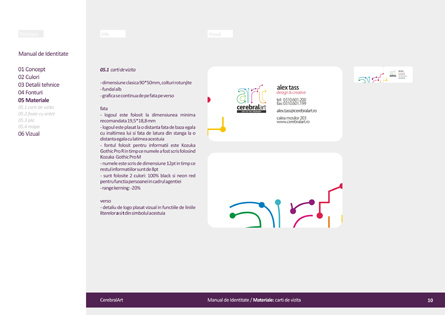
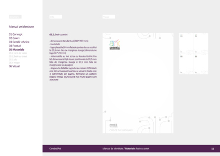
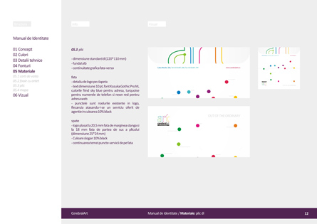
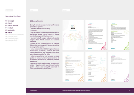
Stationery design: letterhead, envelope and business cards design. You can see a bit smaller the colors-services relation and also how the stationery elements look side by side with the design continuing from front to back (envelope and business cards) or side by side (letterheads).

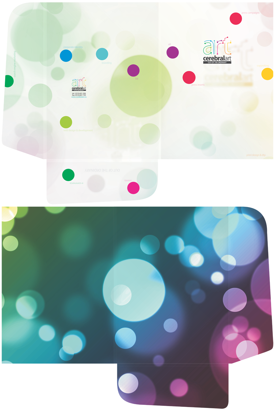
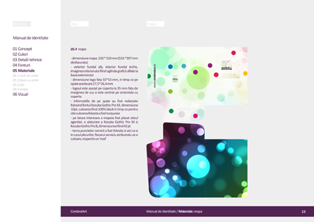
Folder design: lighter outside and darker inside
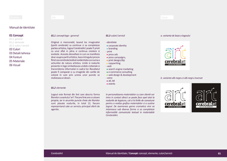
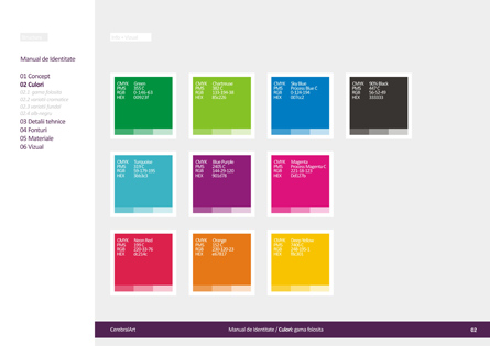
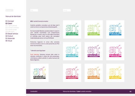
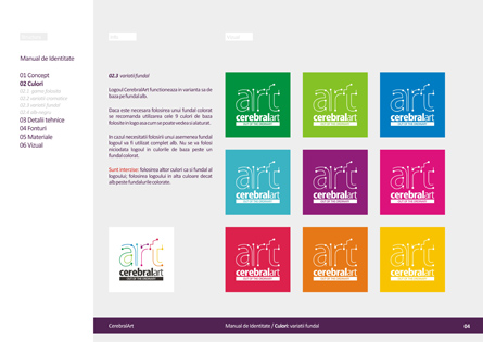
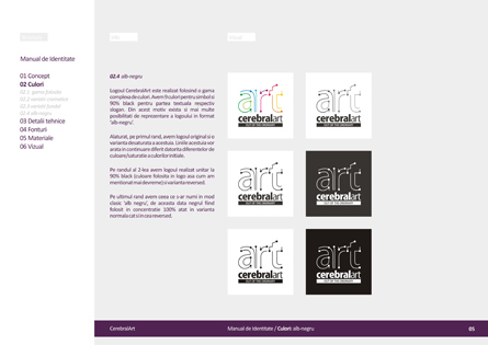
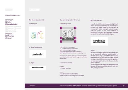
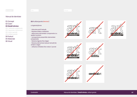
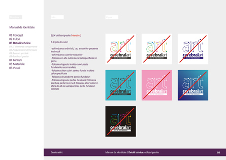
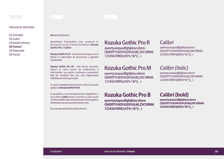
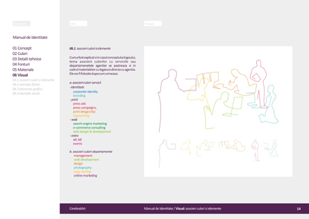
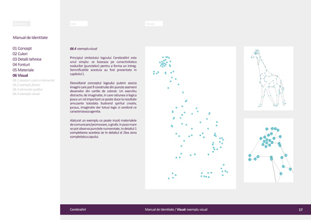
Brand manual / logo guidelines / visual identity manual design contains the logo details and explanation of the concept, elements and the colors – services relation; the usage rules for the logo (accepted logo colors, background colors, black and white variations); technical details (components, sizes, special situations and forbidden usage of the logo); fonts to be used in the identity design; stationery design details (business cards, letterhead, envelope and folder) and an extra visual chapter with examples of graphics that can accompany the logo in the visual communication of the agency.

A small flash animation for the under construction stage of the agency website.


