Nextime
Nextime is a fresh, new clubbing / electronic music portal. We started the logo from the 3 dots that form an arrow (which is now the symbol), pointing out the future, the ‘next’, and then we’ve build all the other letters based on the arrow / next symbol.Logo, website layout, magazine cover. June-July 2011.
A few logo variations.
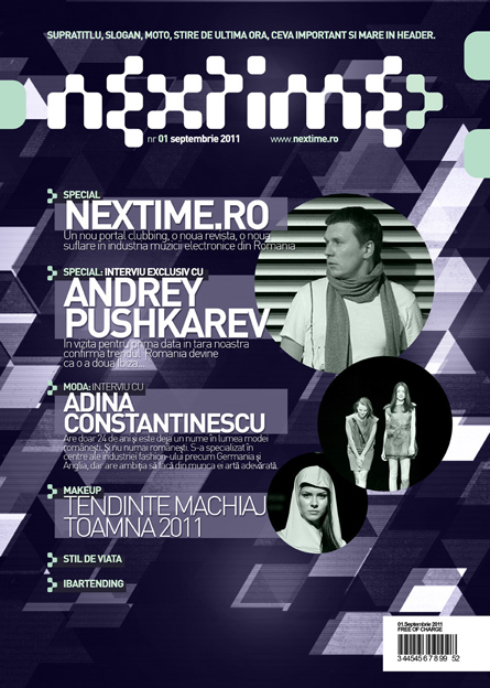
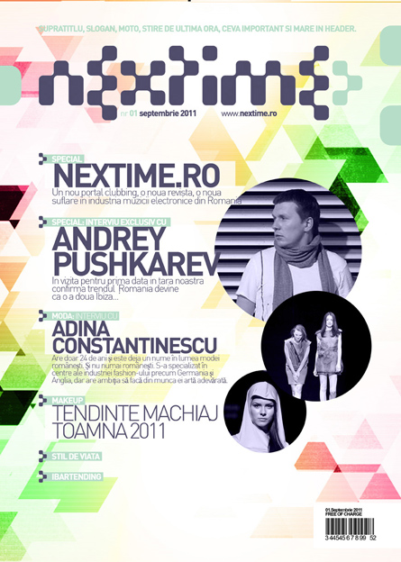
Magazine cover layout design.

Website layout. Nextime will feature in it’s pages all that is new and fresh both in local and international electronic music scene: news, events, locations, photos, videos, ibartending, downloads, contests, the premium content being also featured in an online magazine.
We have used the three dots arrow logo symbol to create a pattern for the website background and we have also included the arrow style design in the layout design buttons.
And here are a few details of the design:


